West Coast Brewing's Logo
& Odd Owl Oatmeal Stout Packaging Design
& Odd Owl Oatmeal Stout Packaging Design
Conceptual Vision
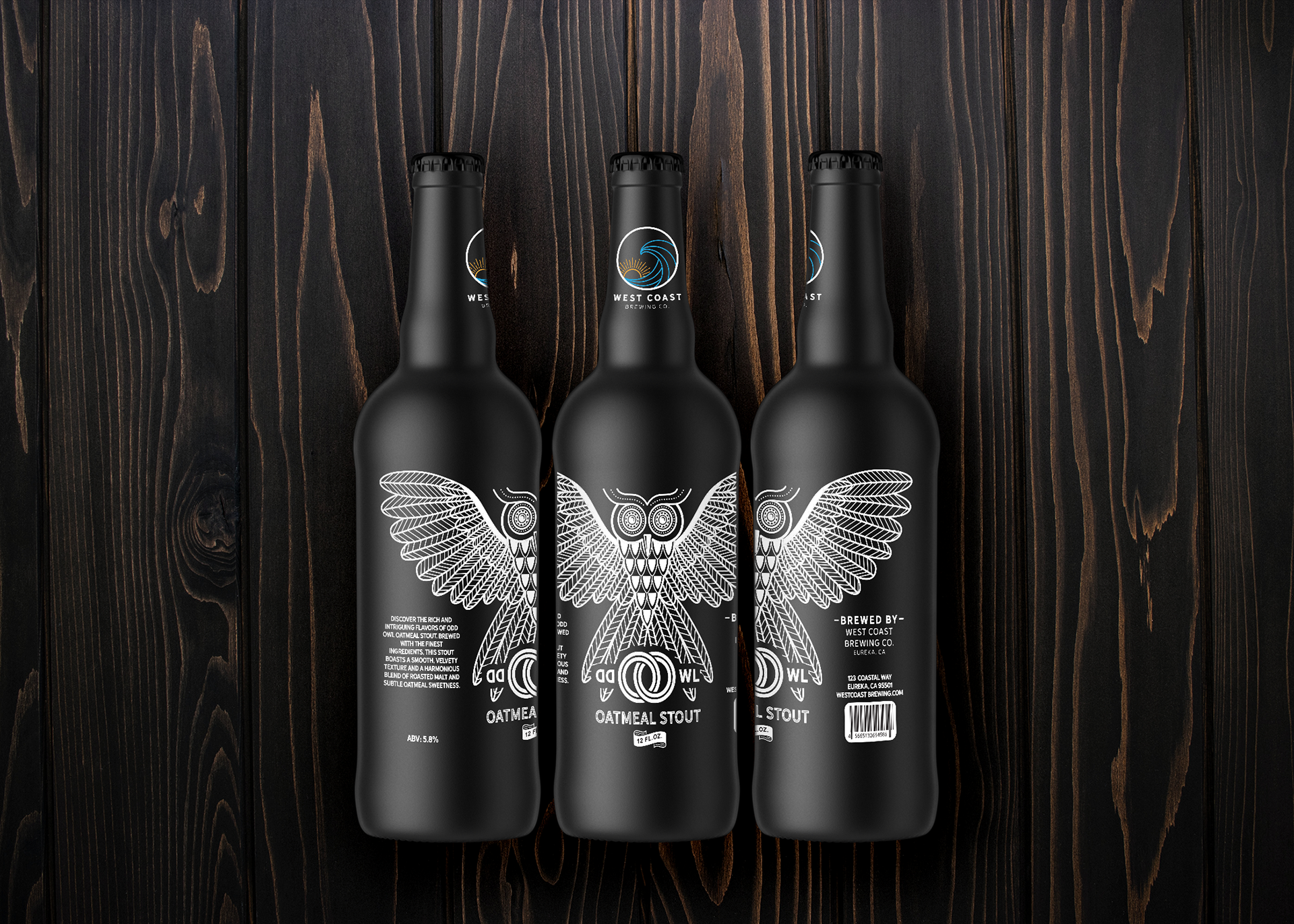
Our primary goal for the Odd Owl Oatmeal Stout was to create a packaging design that stands out on the shelves while embodying the unique and premium nature of the beer. I aimed to combine a modern minimalist aesthetic with a touch of art nouveau elegance, resulting in a design that is both contemporary and timeless.
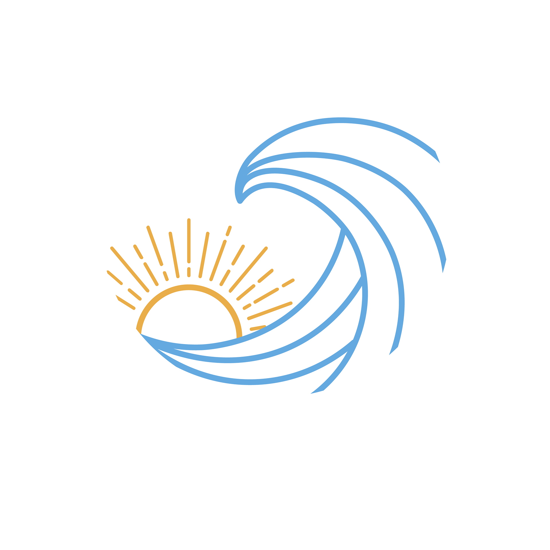
West Coast Brewing's Logo Design
Concept
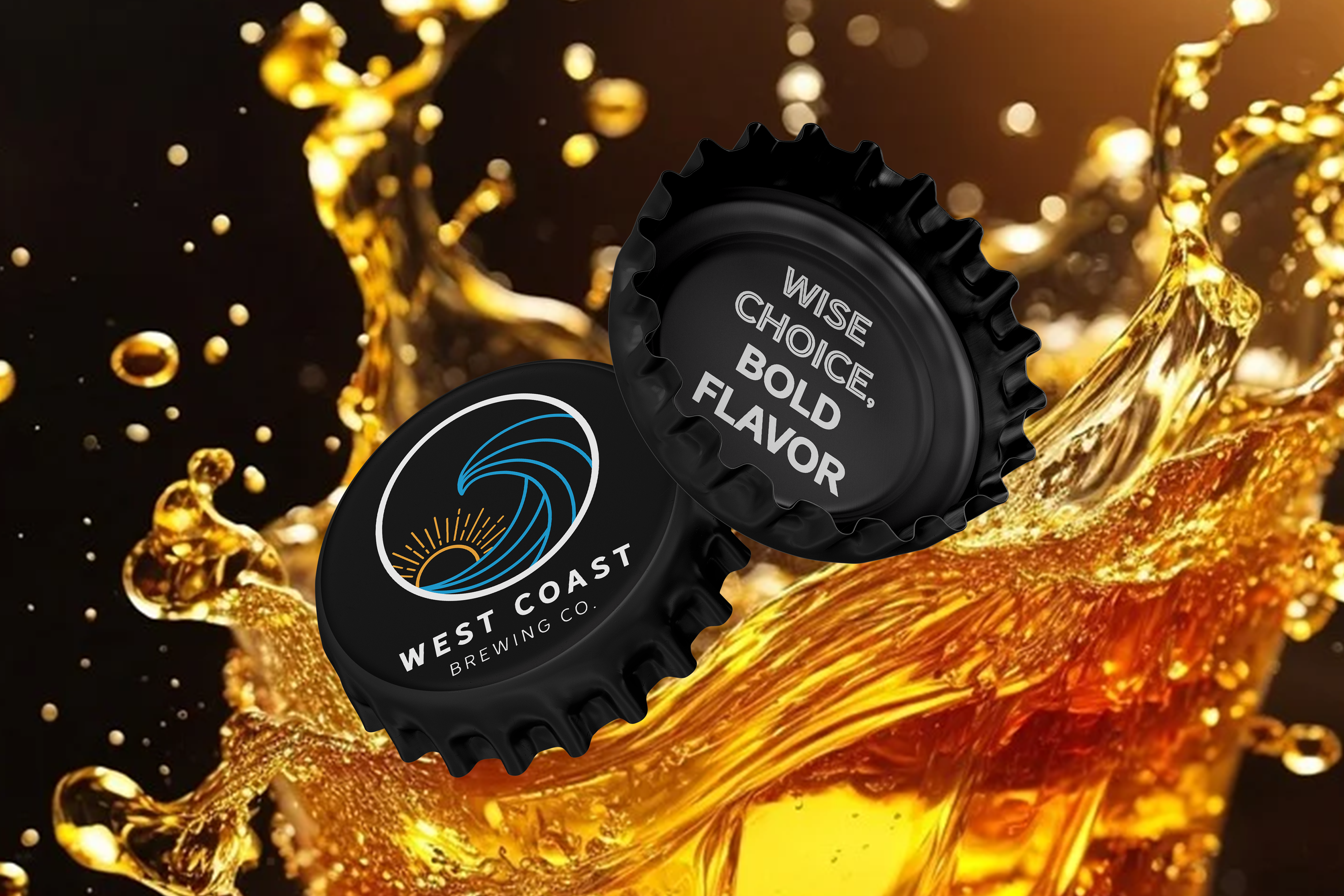
The logo for West Coast Brewing Co. aims to encapsulate the vibrant and adventurous spirit of the West Coast. By using a line art minimalist style, the design remains modern and clean, while art nouveau elements add a touch of elegance and sophistication. The color palette features a blue wave and an orange sun, symbolizing the ocean and the sun-drenched coastlines.
The logo for West Coast Brewing Co. aims to encapsulate the vibrant and adventurous spirit of the West Coast. By using a line art minimalist style, the design remains modern and clean, while art nouveau elements add a touch of elegance and sophistication. The color palette features a blue wave and an orange sun, symbolizing the ocean and the sun-drenched coastlines.
Design Process
I started with a series of sketches to capture the fluid motion of a wave. The wave is simplified into smooth, flowing lines to maintain a minimalist aesthetic. For the sun, I incorporated an art nouveau-inspired sun flair, giving it a radiant, yet stylized look. I used Adobe Illustrator to translate the final sketch into digital line art.
I started with a series of sketches to capture the fluid motion of a wave. The wave is simplified into smooth, flowing lines to maintain a minimalist aesthetic. For the sun, I incorporated an art nouveau-inspired sun flair, giving it a radiant, yet stylized look. I used Adobe Illustrator to translate the final sketch into digital line art.
Typography
I chose Hanley Sans for the primary text and Hanley Sans Inline Only for accentuation, ensuring the typography complements the line art while adding a touch of vintage charm.
I chose Hanley Sans for the primary text and Hanley Sans Inline Only for accentuation, ensuring the typography complements the line art while adding a touch of vintage charm.
Color Palette
I wanted to add a pop of color for the wave and sun. I used a ruddy blue color (C=70 M=15 Y=0 K=0) for the wave to invoke the ocean, and a warm, vibrant orange (C=0 M=35 Y=85 K=0 1) for the sun, contrasting beautifully with the blue wave.
I wanted to add a pop of color for the wave and sun. I used a ruddy blue color (C=70 M=15 Y=0 K=0) for the wave to invoke the ocean, and a warm, vibrant orange (C=0 M=35 Y=85 K=0 1) for the sun, contrasting beautifully with the blue wave.
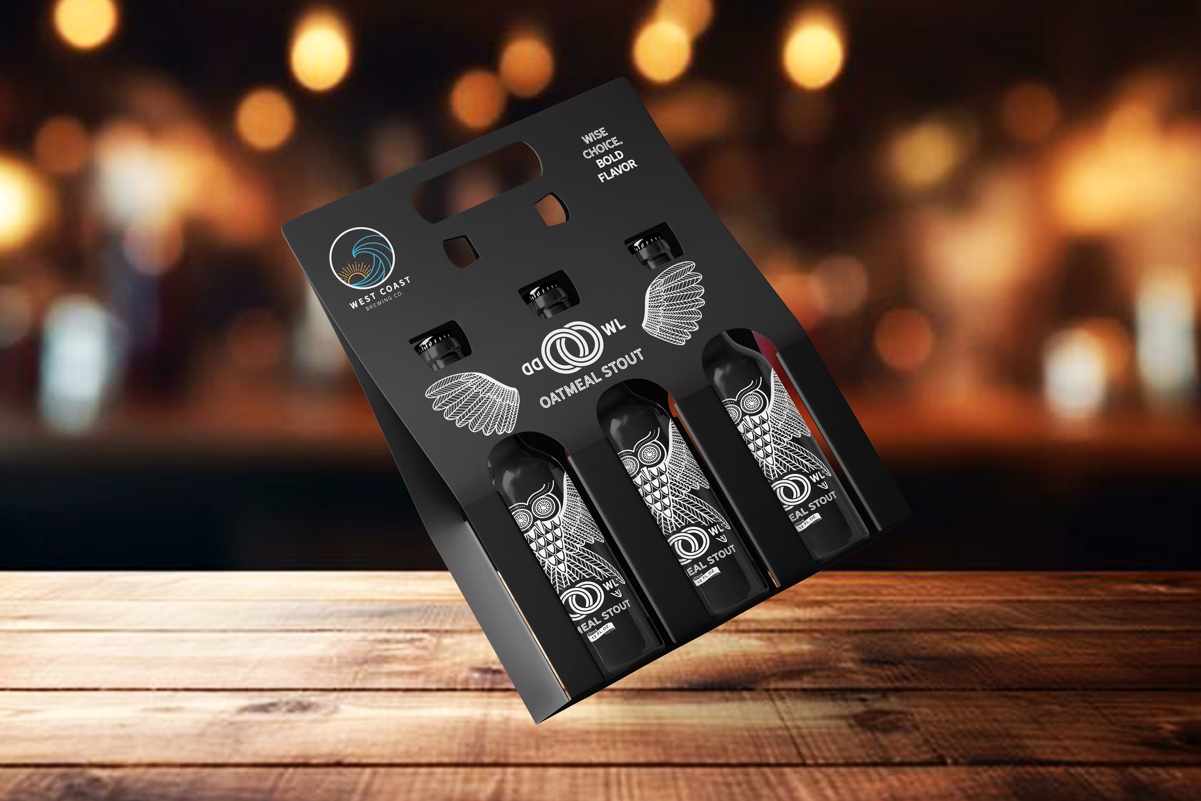
Odd Owl Oatmeal Stout Packaging Design
Conceptual Vision
For the Odd Owl Oatmeal Stout, the objective was to create a label that stands out on the shelf, reflecting the uniqueness of the beer through a modern minimalist art nouveau design. The "Odd Owl" needed to be the focal point, symbolizing both the quirky and sophisticated nature of the stout.
Owl Illustration
The Odd Owl Oatmeal Stout is rich, smooth, and slightly eccentric. This owl character needed to be visually represented through the label. It was crafted meticulously in Adobe Illustrator. To modernize the art nouveau style, I stripped down the owl design to its essential lines and shapes, ensuring it remained intricate yet clean. The illustration features clean lines and minimal detailing, characteristic of modern minimalist art, yet it retains the flowing, ornamental qualities of art nouveau. This blend gives the owl a distinctive, almost enigmatic presence that draws the eye.
The Odd Owl Oatmeal Stout is rich, smooth, and slightly eccentric. This owl character needed to be visually represented through the label. It was crafted meticulously in Adobe Illustrator. To modernize the art nouveau style, I stripped down the owl design to its essential lines and shapes, ensuring it remained intricate yet clean. The illustration features clean lines and minimal detailing, characteristic of modern minimalist art, yet it retains the flowing, ornamental qualities of art nouveau. This blend gives the owl a distinctive, almost enigmatic presence that draws the eye.
Typography
Primary Font: Hanley Sans – This font is used for "Odd Owl." It's a clean, bold sans-serif style that adds a touch of vintage sophistication while maintaining readability.
Secondary Font: Hanley Sans Inline – This font is used for "Oatmeal Stout" to make it stand out and add a bit of pizzazz to grab the eye.
Tertiary Font: Hanley Sans Inline Only - This font is used for the contact details as a complementary font with Hanley Sans.
Summary
The design for West Coast Brewing's logo and the Odd Owl Oatmeal Stout packaging seamlessly blend modern aesthetics with classic influences. The logo captures the dynamic spirit of the West Coast, while the beer label's minimalist art nouveau owl provides a distinctive and sophisticated look. This design approach not only makes the product stand out on shelves but also reinforces the brand’s identity and commitment to quality and creativity.