
Babe's Pizza & Pasta Rebrand Concept
A logo & website rebrand for a local mom-and-pop pizzeria in Eureka, CA.
Overview
Babe's Pizzeria has been a beloved staple in Eureka, CA since 1991, serving delicious, handcrafted pizza to the community. As part of my rebranding effort, my goal was to maintain the nostalgic and warm spirit of Babe's while updating its visual identity and online presence to appeal to modern customers.
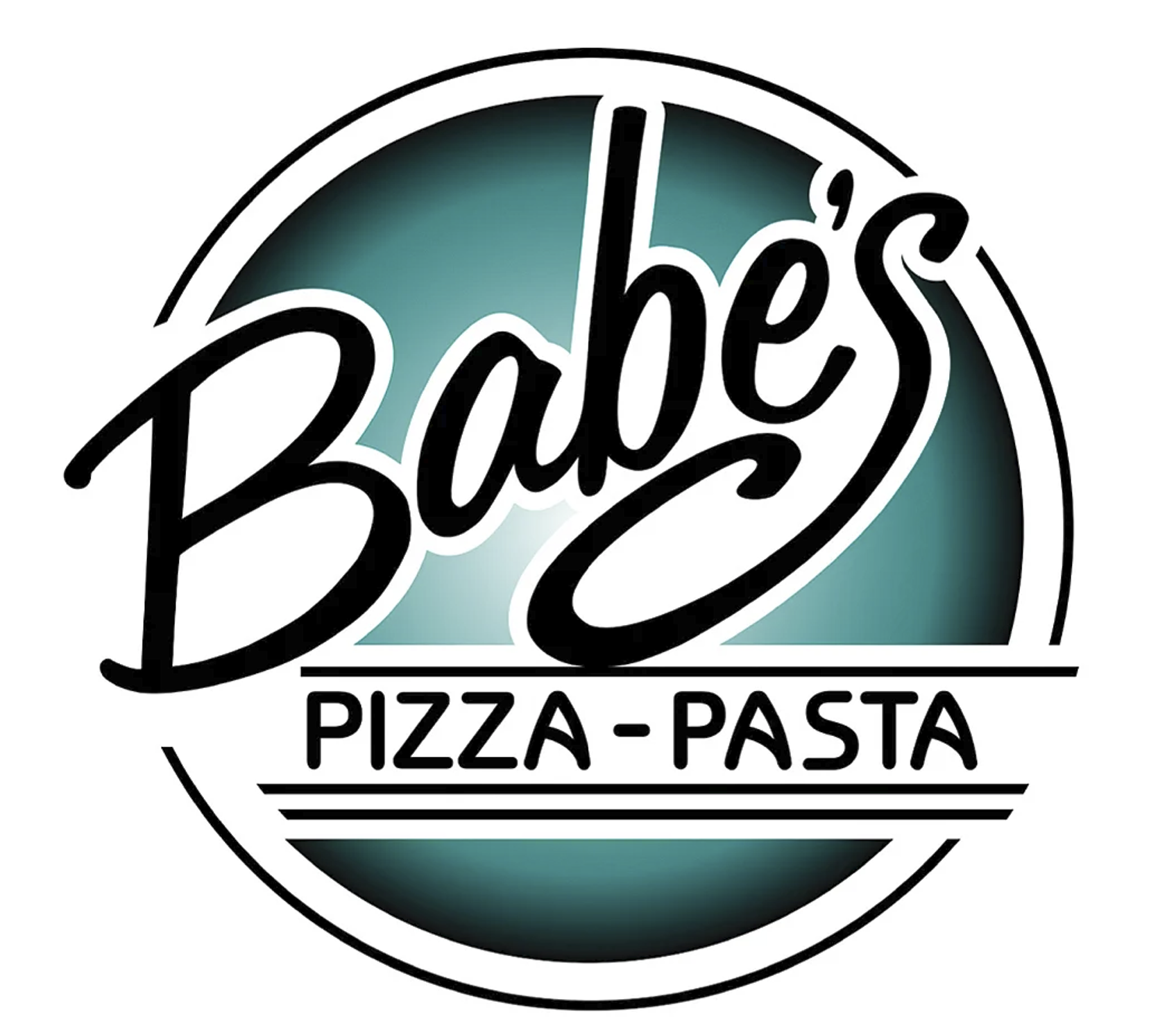
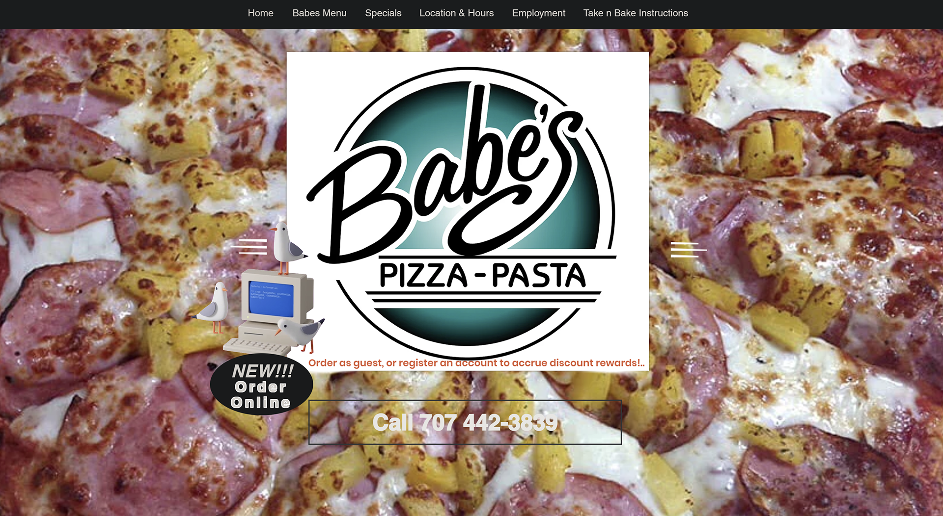
Former Logo & Website
Below is a look at what Babe's had as their logo and website before the rebrand.
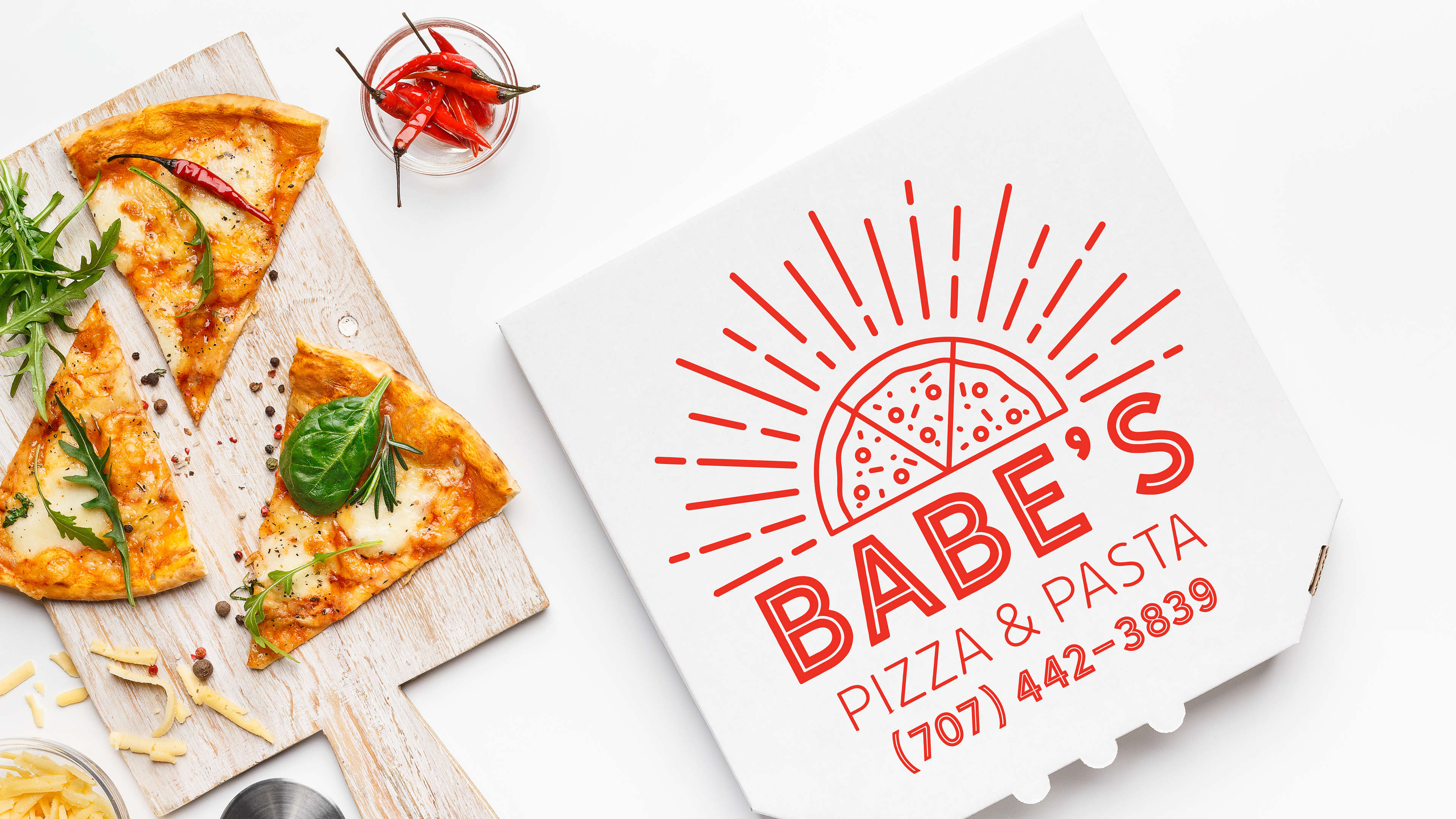
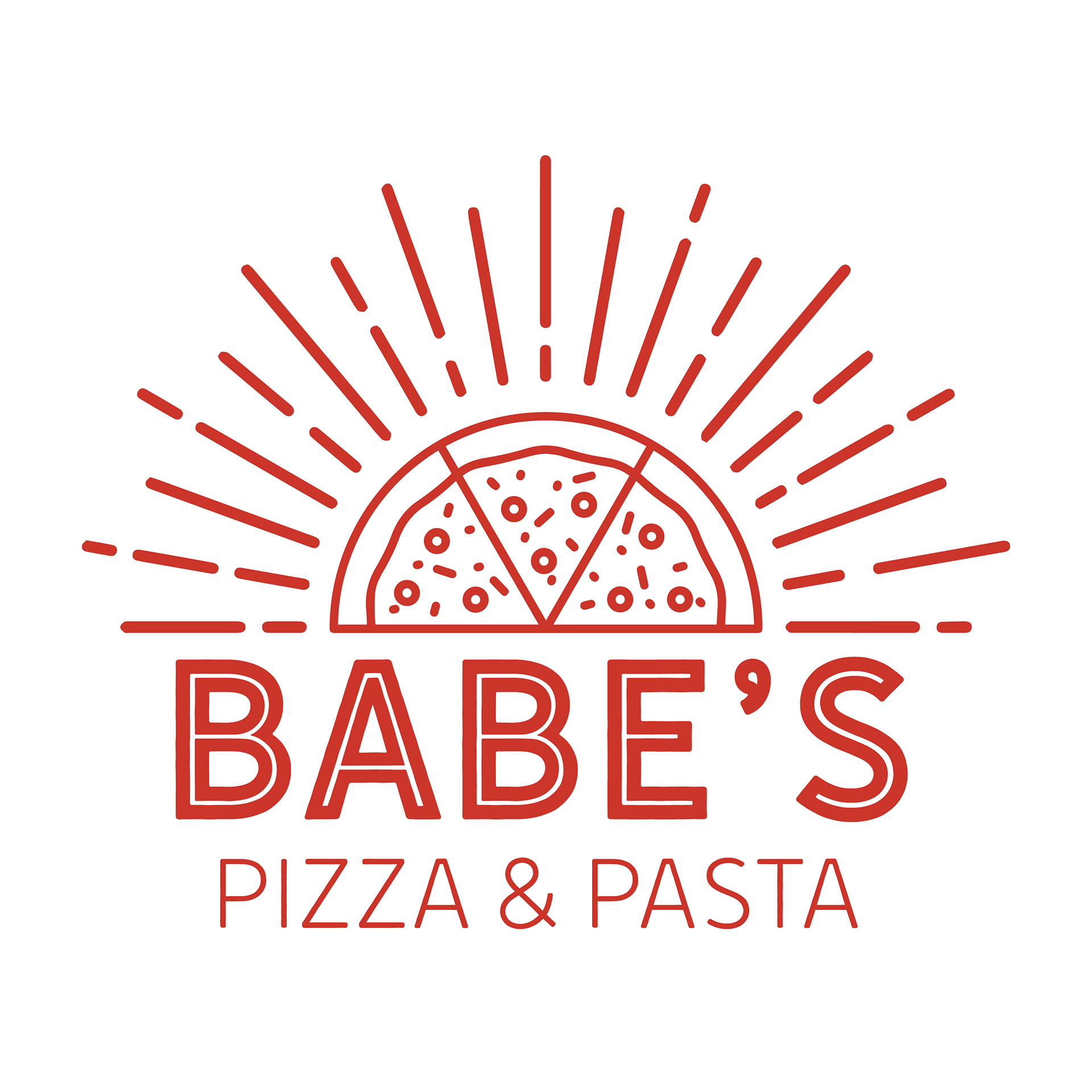
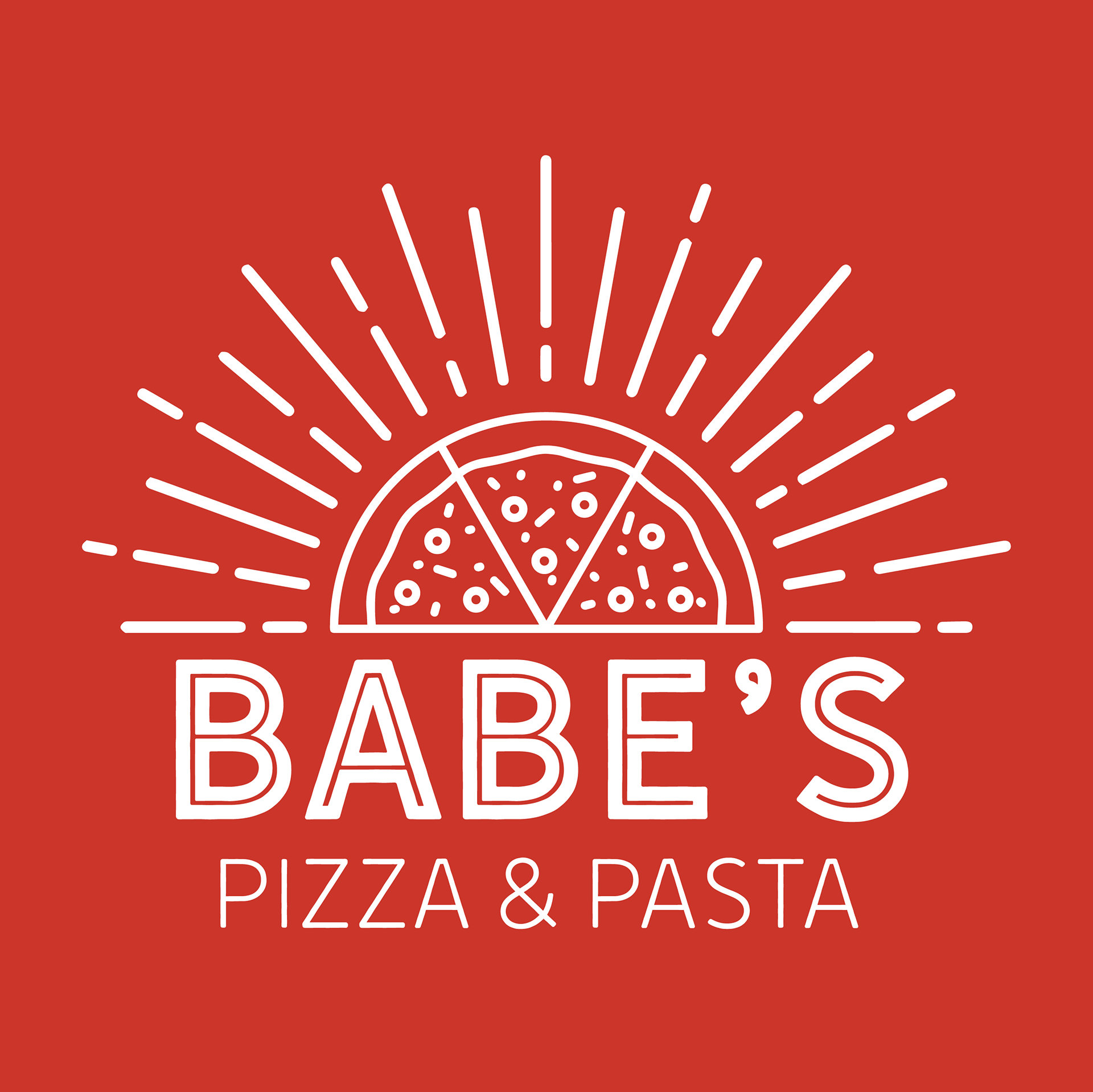
Logo Rebranding
Concept: The new logo features a combination of sun rays and a minimalist line design of a pizza. This symbolizes the warmth, happiness, and delicious food that Babe's Pizzeria has been known for over the decades.
Typography: I used the Hanley Sans Inline and Hanley Sans Inline Only fonts. These fonts provide a vintage yet clean look that respects the heritage of Babe's while bringing it into a more contemporary context.
Color Palette: Parisian Red (C=1 M=94 Y=100 K=0) is the primary color. This vibrant red evokes passion and excitement, aligning with the flavorful and hearty pizzas that Babe's offers.
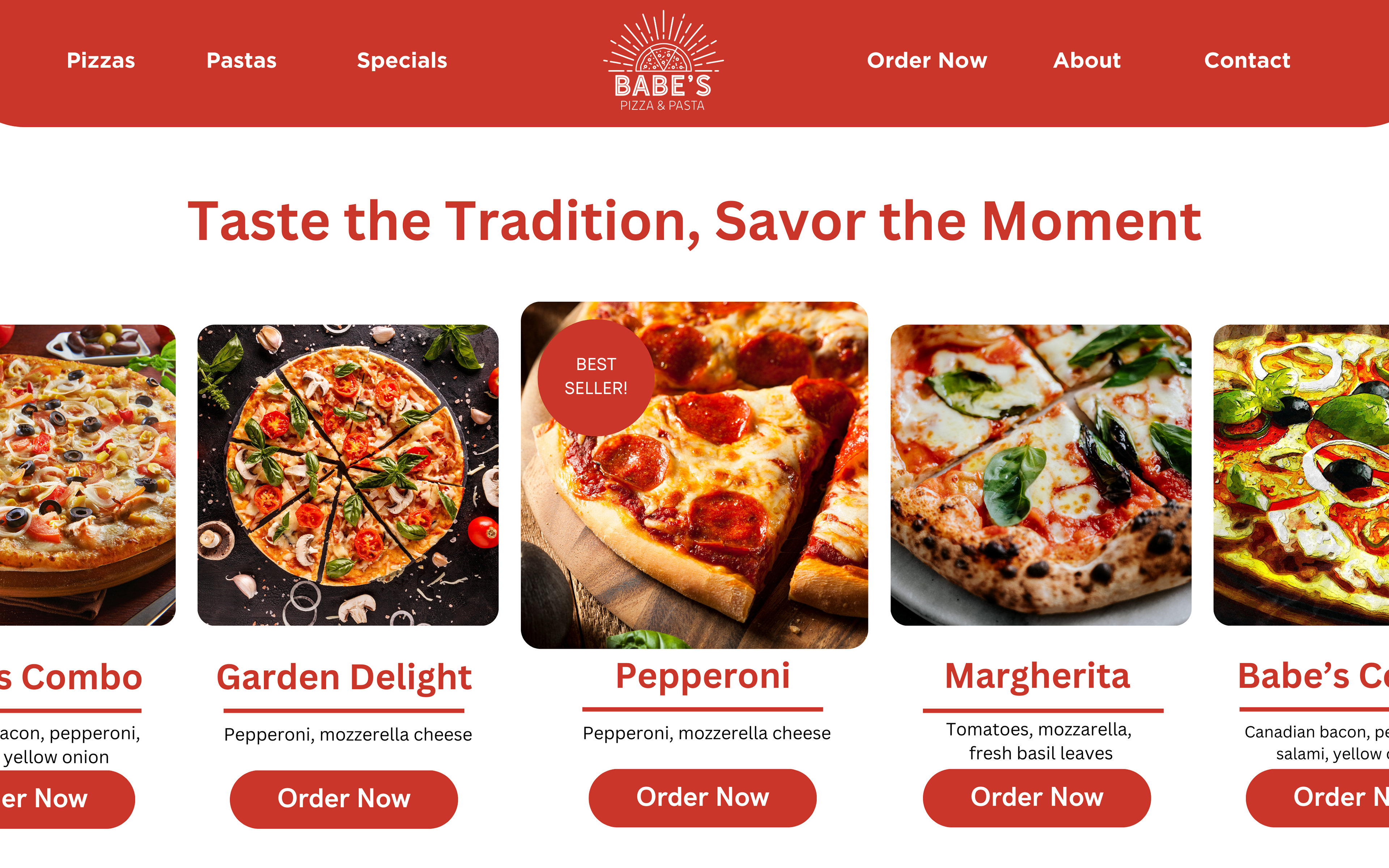
Website Redesign
Problem: Babe's former website had an outdated 1990s design that does not reflect the quality and warmth of their offerings. The navigation is clunky, the layout is cluttered, and the aesthetic does not engage modern customers.
Modern Layout:
• Homepage: A clean, welcoming homepage featuring high-quality images of the pizzas, the new logo prominently displayed, and a brief welcome message.
• Navigation: Streamlined with clear categories such as Menu, About Us, Locations, Order Online, and Contact.
• Responsive Design: Ensure the website is mobile-friendly, providing a seamless experience across all devices.
• Navigation: Streamlined with clear categories such as Menu, About Us, Locations, Order Online, and Contact.
• Responsive Design: Ensure the website is mobile-friendly, providing a seamless experience across all devices.
Visual Aesthetics:
• Color Scheme: I used Parisian Red as the primary color, complemented by neutral tones like white and light grays to keep the focus on the delicious food.
• Typography: Consistent use of Hanley Sans Inline and Hanley Sans Inline Only throughout the site for a cohesive look.
• Typography: Consistent use of Hanley Sans Inline and Hanley Sans Inline Only throughout the site for a cohesive look.
Enhanced User Experience:
• Online Ordering: An easy-to-use online ordering system with clear visuals of menu items and a straightforward checkout process.
• Social Media Integration: Links to social media profiles and a live feed of recent posts to engage with the community.
• Customer Reviews: Highlight positive customer reviews and testimonials to build trust and showcase the pizzeria's long-standing reputation.
• Social Media Integration: Links to social media profiles and a live feed of recent posts to engage with the community.
• Customer Reviews: Highlight positive customer reviews and testimonials to build trust and showcase the pizzeria's long-standing reputation.

Summary
The rebranding of Babe's Pizzeria aims to blend the charm and nostalgia of its history with a fresh, modern aesthetic. The new logo featuring sun rays and a pizza line design in Parisian Red, along with the redesigned website, will create a cohesive, appealing brand identity that honors the past while looking forward to a bright future. This transformation will help Babe's Pizzeria attract new customers and continue to be a cherished part of the Eureka community for years to come.