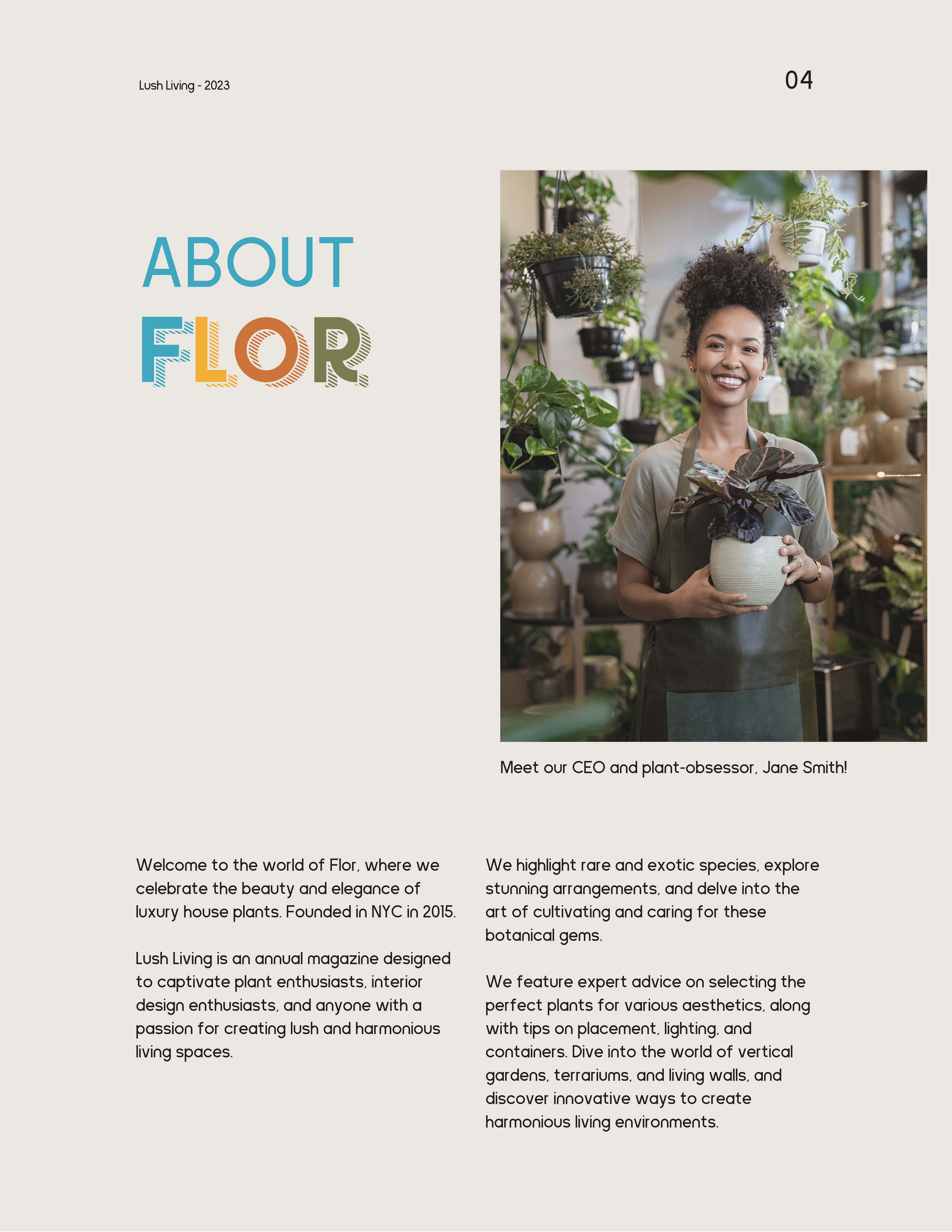
FLOR Identity & Magazine Design
Creating the brand identity and magazine design for FLOR has been an exciting and creatively fulfilling project. FLOR, as a brand, is all about curating and celebrating exotic and rare plant species from different corners of the world. The primary focus was to develop a visual identity that embodies modern minimalism, timeless sophistication, and a strong connection to nature.
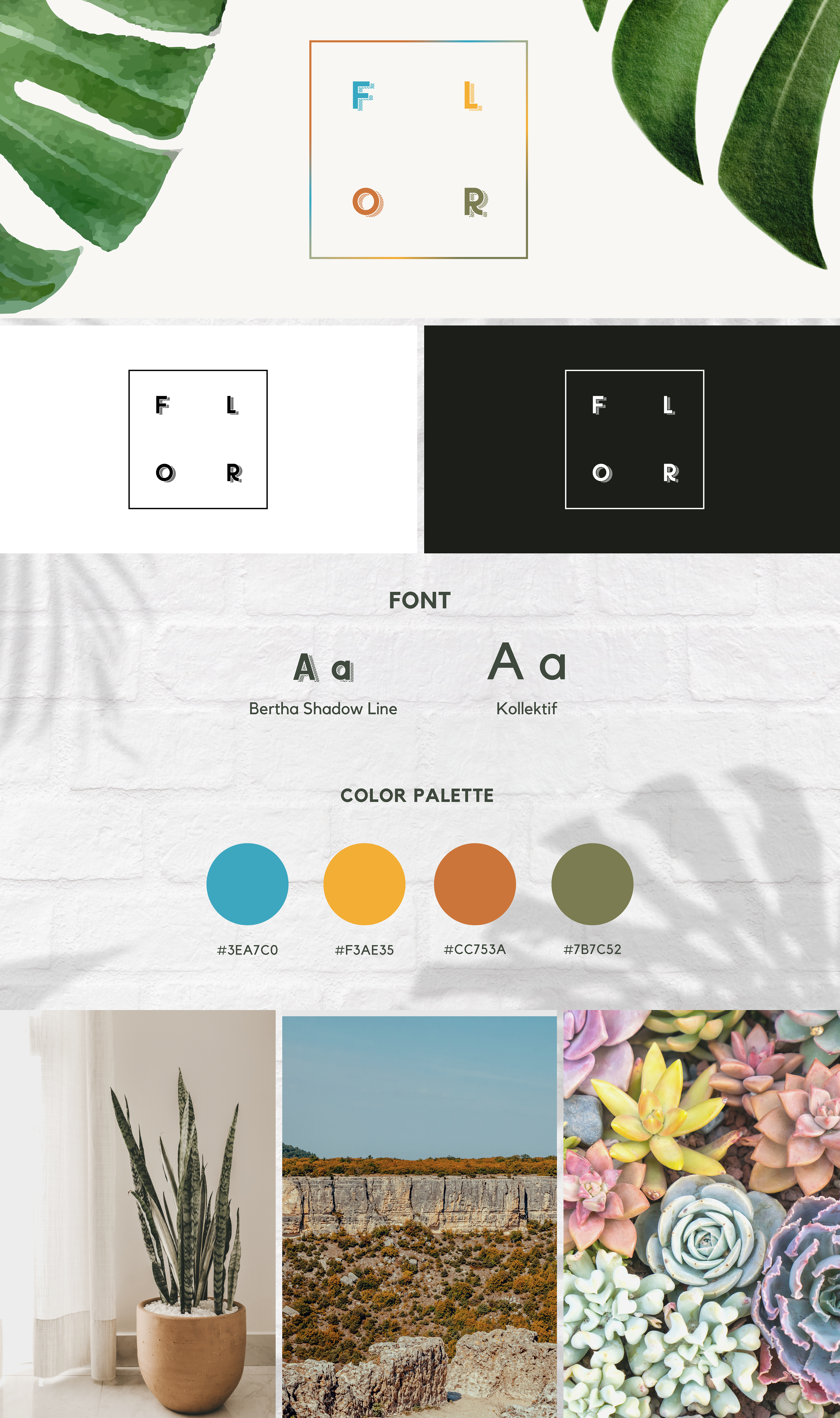
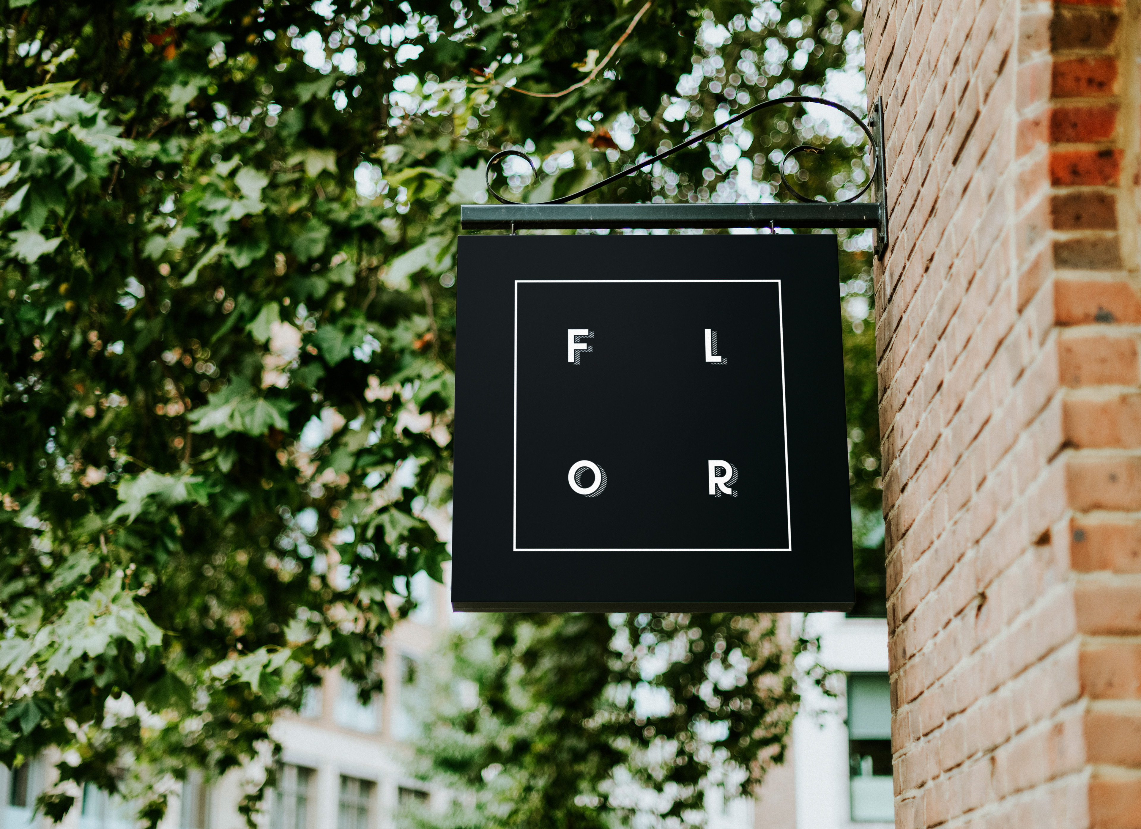
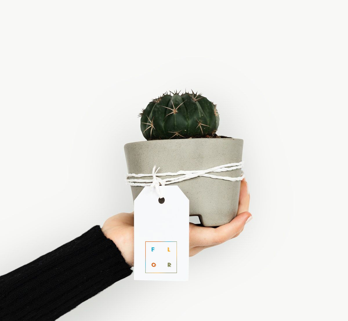
Logo Design: The logo design is at the heart of the FLOR identity. It was essential to convey the brand's ethos of simplicity and elegance while reflecting the company's contemporary approach. The logo I created adheres to clean, minimalistic principles. It's an emblem of simplicity, featuring a distinctive, abstract representation of a plant, possibly a succulent or an exotic leaf. This iconography not only signifies the core product but also reflects the modern and streamlined character of the brand. The choice of clean lines and a lack of unnecessary ornamentation create a lasting, memorable image that resonates with Flor's commitment to excellence and quality.
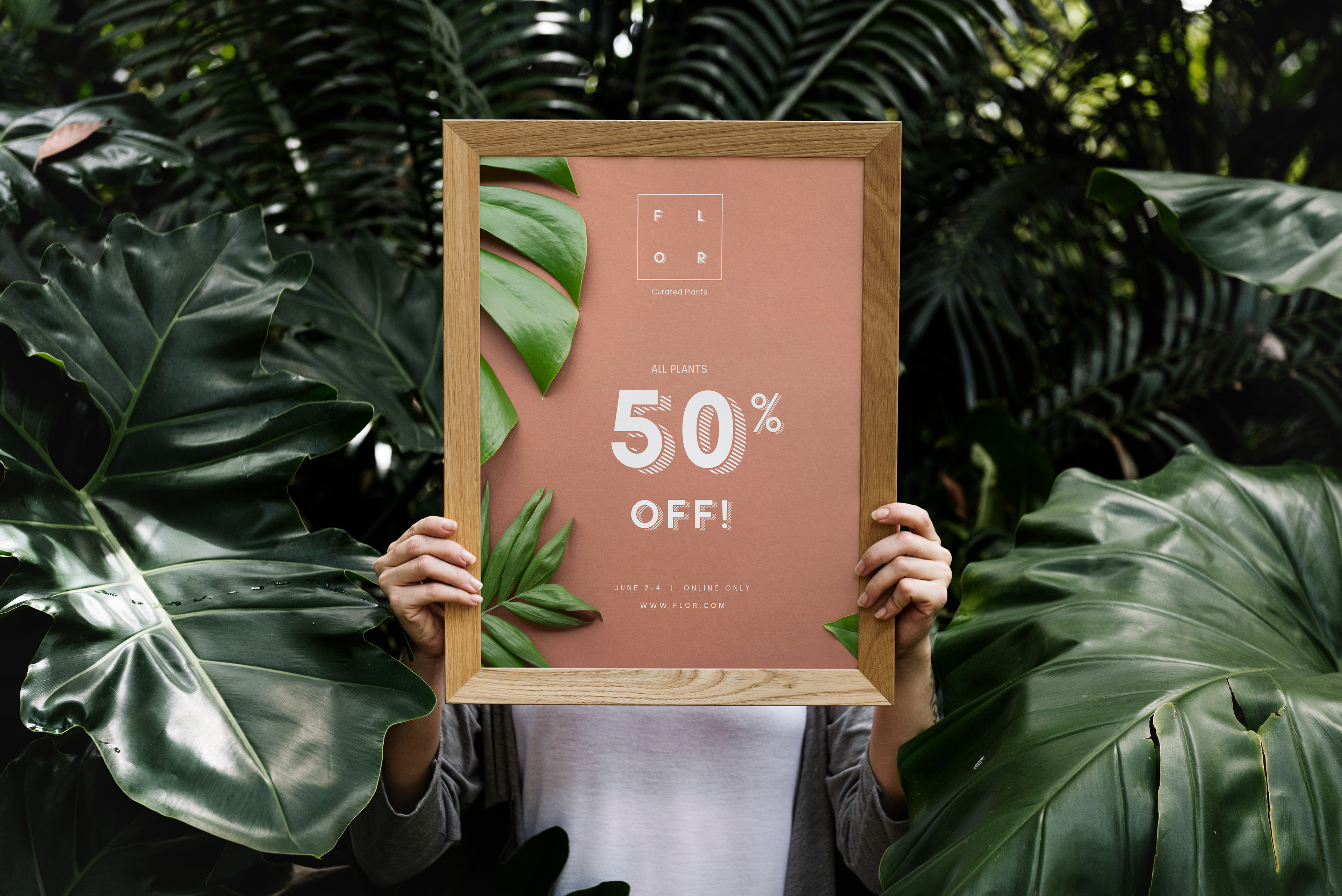
Color Palette: The color palette for FLOR was thoughtfully chosen to reflect a connection with nature while maintaining a modern and elegant look. Natural tones, reminiscent of desert landscapes and succulent plants, dominate the palette. These earthy and calming colors establish a serene and organic vibe, making customers feel as though they're stepping into a tranquil botanical oasis whenever they interact with the brand.
Magazine Design: The magazine design for FLOR is a visual extension of the brand's identity. It serves as a platform to showcase exquisite plant species, offer valuable insights into plant care, and connect with plant enthusiasts. The magazine layout adheres to the same principles of modern minimalism and timeless sophistication. Clean, uncluttered layouts are used, with a focus on high-quality imagery to let the beauty of the plants speak for itself. The color palette is seamlessly integrated into the magazine's design, creating a cohesive and aesthetically pleasing reading experience.
The choice of typography is equally important in the magazine design. It complements the clean and sophisticated look, ensuring that content is easy to read and visually appealing. The use of ample white space throughout the magazine design allows the plant photography to shine, giving readers a true sense of the beauty and rarity of the curated species.
In summary, the FLOR identity and magazine design project is a testament to the power of minimalism and nature's beauty. It successfully captures the essence of the brand, where exotic plants meet modern elegance. The careful selection of colors, typography, and layout choices all contribute to creating a visual identity that is both visually appealing and cohesive, providing a luxurious and memorable experience for plant enthusiasts and customers.
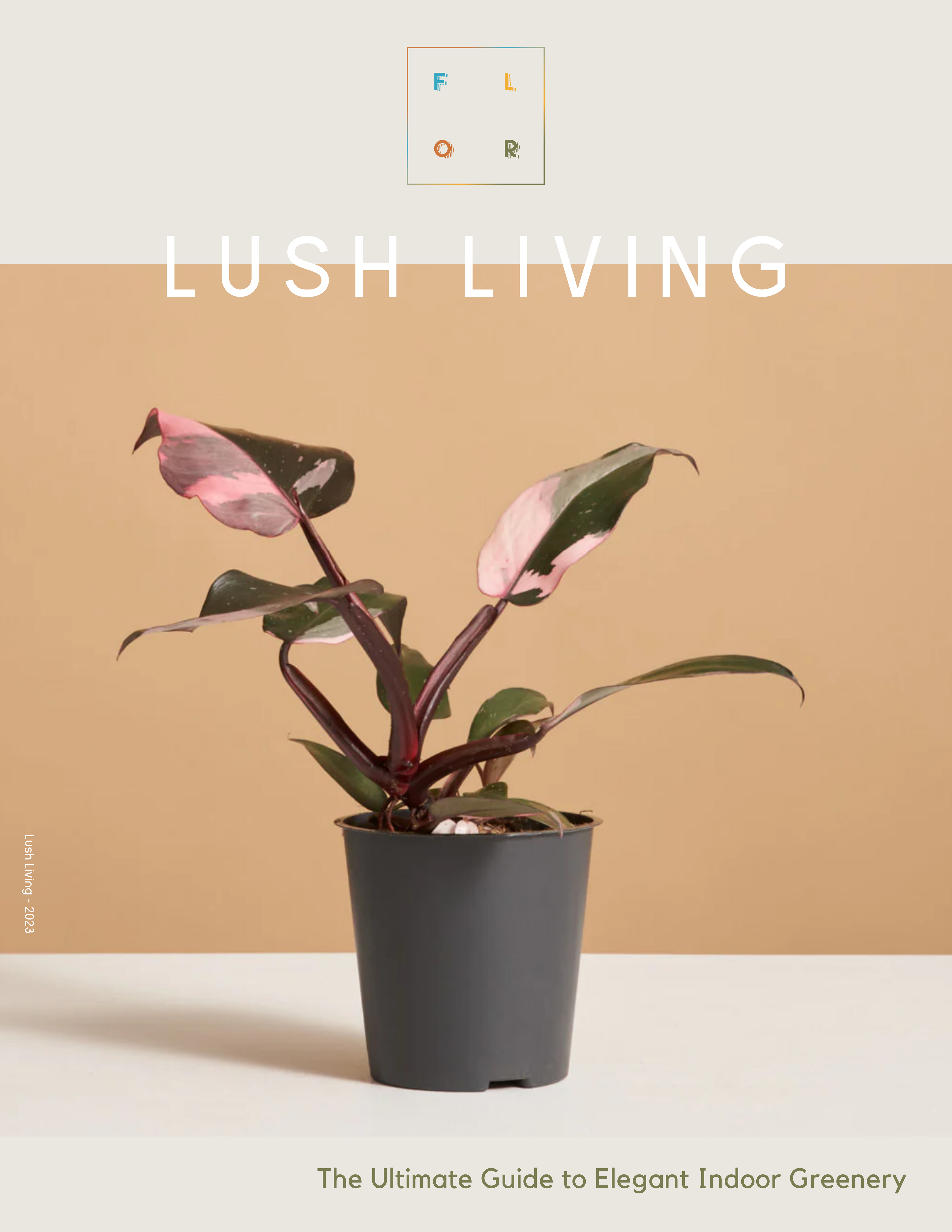
Lush Living: The Ultimate Guide to Elegant Indoor Greenery
First Annual Magazine - Layout Design
First Annual Magazine - Layout Design
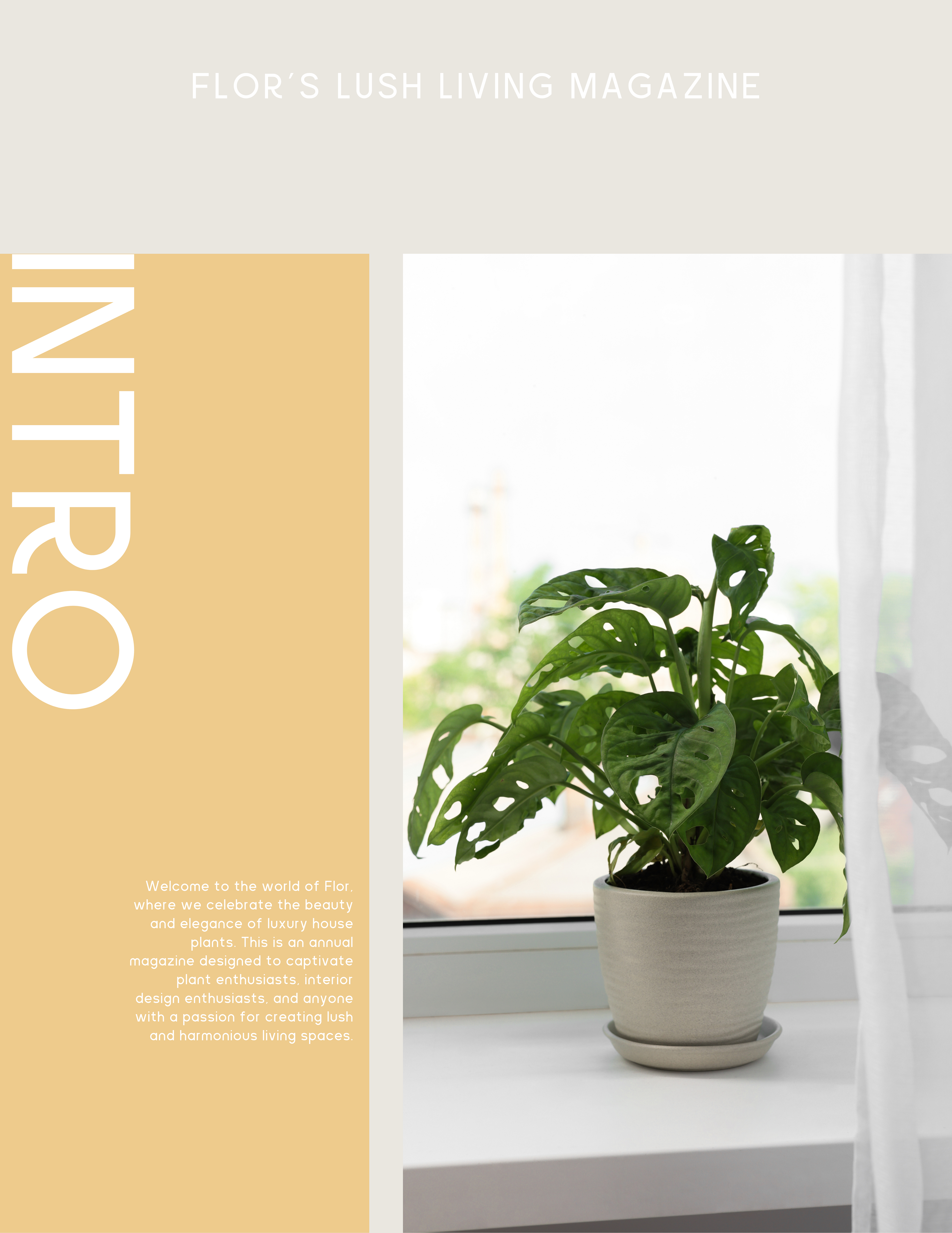
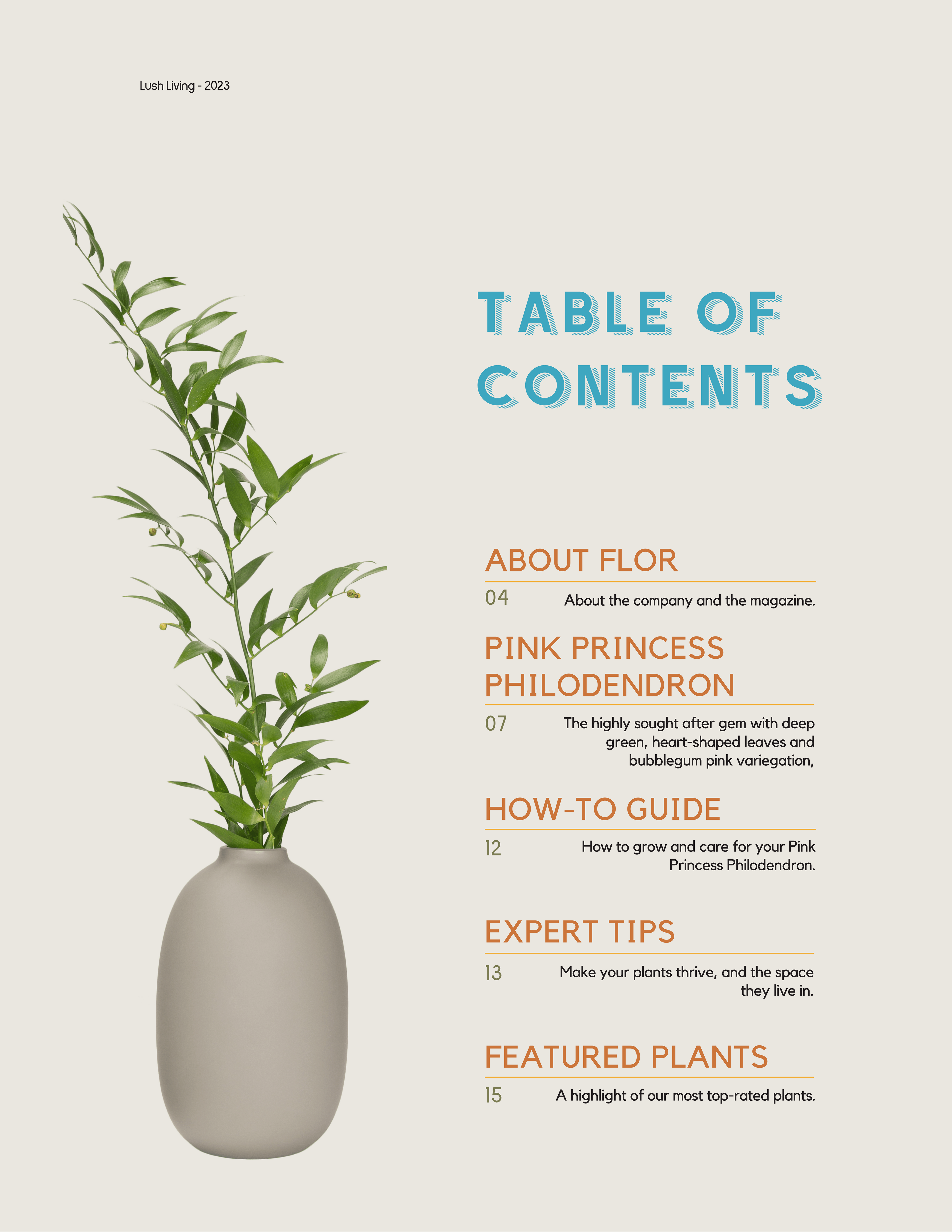
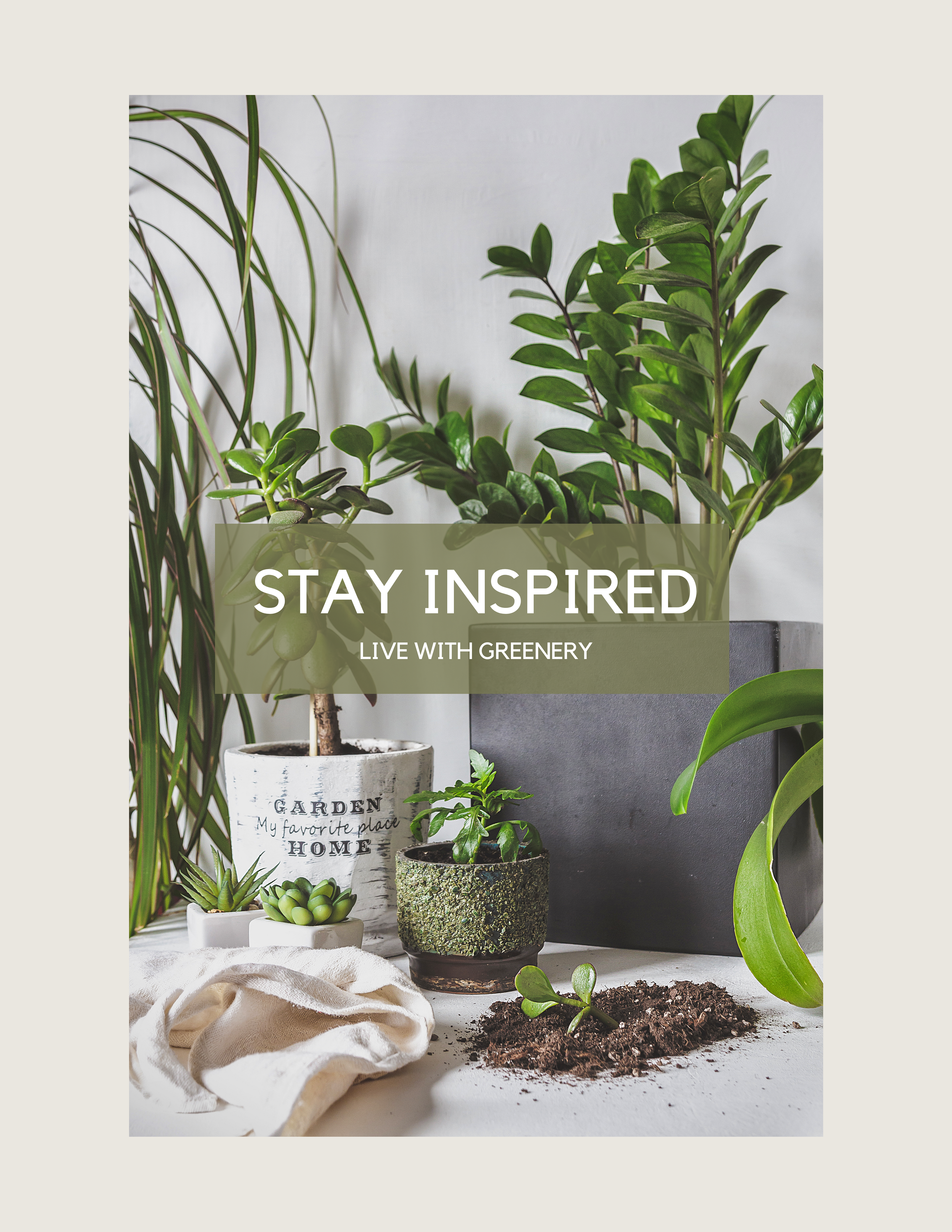
Creating the layout design for the first annual Lush Living magazine, my goal was to create a visually captivating and cohesive experience that reflects the elegance and beauty of luxury house plants. Given the emphasis on the beauty of Flor's luxury house plants, I sought to highlight the photography in the layout flow. I carefully curated a collection of visually stunning images that aligned with the overall mood and theme of each article. I used the earthy brand colors and fonts I created for the brand identity. I also incorporated design elements inspired by nature, such as organic shapes, botanical motifs, and elegant patterns. These elements were used sparingly to maintain a clean and uncluttered layout.